
AI Upscaling Artifacts: How to Spot and Fix Them
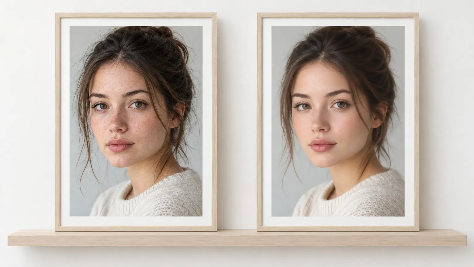
Most AI upscaling artifacts show up at 100% zoom in the same few places: skin, text, hard edges, repeating textures and faces. Skin that has lost its pores, letters that almost spell something, and a thin bright line around every edge are the usual signs. Each one has a cause, and each has a fix that takes less than a minute.
An upscaler can't recover detail the camera never recorded. It predicts plausible detail from patterns it learned, and an artifact is a prediction that looks wrong. The fix is rarely "try again". It is a smaller scale, a cleaner source or leaving one region alone.
Why artifacts happen
In 2017 Blau and Michaeli proved mathematically that distortion (how far the output is from the true image) and perceptual quality (how natural it looks) pull against each other. Models trained to look sharp and natural accept a bit more error against the original. That error is where artifacts live.
The ESRGAN paper says it plainly about its predecessor: hallucinated details are "often accompanied with unpleasant artifacts". Its successor Real-ESRGAN, a widely used open model, lists the same trouble in its own limitations section: twisted lines on buildings and indoor scenes, unpleasant artifacts from GAN training, and degradations outside what it was trained on, which it "may amplify". If you want the mechanism behind that guessing, how AI rebuilds detail walks through it.
The practical rule: the less real information is in the source, the more the upscaler has to invent, and the more visible the inventions become.
How to inspect a result
Open the output at 100%, where one image pixel is one screen pixel. Fit-to-screen hides almost everything on a large image. Then check five places, in this order: faces and skin, any text, high-contrast edges, repeating surfaces, and fine lines on buildings or furniture. Comparing against the original at the same crop is faster than judging the result alone, which is why a before/after slider helps.
Waxy, poreless skin
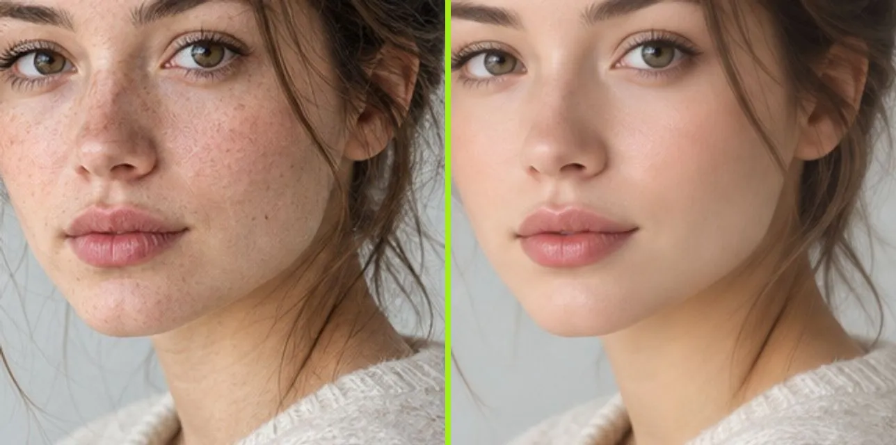
What it looks like: skin with no pores, freckles or fine lines, a plastic sheen on the forehead and cheeks, and hair that clumps into soft painted strands. Real pores differ in size and spacing. If every pore looks the same and sits on a neat grid, the texture was invented.
Why: when a face is only a few dozen pixels wide, the pores were never captured. The model averages the area to something plausible and clean.
Fix: use 2x, not 4x. A smaller scale invents fewer pixels, so there is less to smooth. If you only need the face for a social post, accept the slightly softer 2x result over a glossy 4x one.
Invented or garbled text
What it looks like: letters that have the right rhythm but wrong shapes: an "e" that turns into an "a", signs where words become near-words, numbers that change.
Why: compressed small text holds too few pixels to tell letters apart, so the model draws the most likely stroke. A wrong guess still looks crisp, which makes it more dangerous than blur.
Fix: never trust upscaled text for anything that matters. A price, a license plate, a serial number or a line in a contract has to be read from the source or retyped. For screenshots with text, the screenshot upscaling guide covers why that text breaks and what to do instead.
Halos and over-sharpened edges
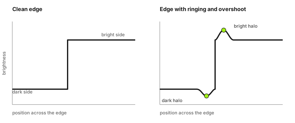
What it looks like: a thin bright outline along dark objects on light backgrounds, or a dark one in the opposite case. The Real-ESRGAN paper describes ringing as "spurious edges near sharp transitions" that look like bands or "ghosts" next to edges, and overshoot as "an increased jump at the edge transition". The graph above shows both.
Why: the source was sharpened before it reached you (phone cameras and scanners often do it), and upscaling enlarges the halo along with everything else. The same paper notes that a model trained without handling for this will amplify the ringing already in the input, "especially around the text and lines".
Fix: if you control the source, turn off in-camera or scanner sharpening and re-export. If you can't, use 2x, which enlarges the halo less than 4x does.
Repeated textures and twisted lines
What it looks like: brick walls where the same few bricks repeat, foliage and grass that tile, fabric with an identical weave patch every few hundred pixels. In architecture, straight lines on window frames, railings and shelves bend or wobble. Real-ESRGAN's authors list exactly this (twisted lines, "especially building and indoor scenes") as a known limit, and attribute it to aliasing in the source.
Why: the model sees a texture it knows, such as brick, and fills the area with its stored idea of brick, even where the real pattern was irregular.
Fix: upscale a crop of the problem area at 2x and check whether it holds. If a building shot bends at 4x, a plain resize will keep the lines straight, at the cost of softness. Straight geometry is the case where a non-AI resize is often the better choice.
Changed faces
What it looks like: the person looks a little different: eyes slightly rounder, a tooth added, an ear reshaped. The face is plausible but not exactly theirs.
Why: a small, blurry face is a guess from a handful of pixels, and the model fills in the most common version of that feature.
Fix: treat an upscaled face as an illustration, not a record. For a family photo, 2x is usually safe. For anything where identity matters, such as ID, evidence or a memorial portrait, use the original and enlarge it with a plain resize.
Blotchy noise and amplified compression
If the source is a heavily compressed JPG, the blocks and mosquito noise around edges get enlarged and sometimes turn into odd textures. Find the least compressed version first. A screenshot of a photo is a worse source than the original file, and a messaging app's copy is worse than both.
The scale decides how many pixels are invented
This is arithmetic, and it explains most of the advice above. At 2x, every source pixel becomes four output pixels, so 3 of every 4 are new. At 4x it becomes sixteen, so 15 of every 16 are new: 93.75% against 75%. A 600 px photo upscaled to 1200 px has 540,000 invented pixels out of 720,000. At 2400 px (4x) it has 5.4 million out of 5.76 million.
So for a first attempt, pick 2x. Go to 4x only when you need the pixels, such as a large print, and only from a clean source. Why 2x often looks more natural than 4x works through where the line sits for common uses.
A fix order that works
- Check the source: least compressed copy, sharpening off, no earlier upscale. Never upscale an already-upscaled file; the first pass's artifacts become the second pass's input.
- Run 2x and inspect at 100% in the five places above.
- If one region fails, keep a plain-resized copy underneath in an editor and mask the AI result away from that region. Faces and text are the usual candidates.
- Use 4x only if 2x is too small, and inspect again.
FreeUpscaler takes images up to 2048 px on the long edge (1024 px on iPhone and iPad) and offers 2x and 4x. After a run you get a before/after slider, so you can check the result side by side in the upscaler before you download. The general method for a clean enlargement is in the full guide to upscaling without losing quality.
If the 2x result has the same artifact the 4x one did, the cause is the source, and no setting will change it.
Ready to try it yourself? It's free, and your files never leave your device.
Try the free AI image upscaler